Project Overview
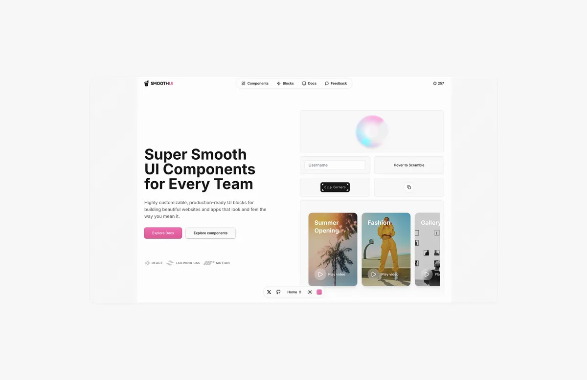
SmoothUI is a comprehensive React UI component library that provides beautifully designed components with smooth animations. Built using modern React patterns, Tailwind CSS v4, and Motion, it aims to enhance user experience through delightful interactions and responsive design.
The Challenge
Developers often struggle to find a UI component library that combines modern design patterns, smooth animations, and easy customization while maintaining optimal performance and accessibility.
Our Solution
SmoothUI addresses these challenges by providing:
- Smooth Animations: Built-in animations powered by Motion for delightful user experiences
- Modern React: Built with React patterns including Server Components, TypeScript, and hooks
- Tailwind CSS v4: Latest utility-first CSS framework with enhanced dark mode support
- Easy Customization: Highly customizable components using Tailwind CSS utility classes
- Production Ready: Production-ready UI blocks for building beautiful websites and apps
Key Features
- Free and Open Source: Completely free to use with no restrictions
- Dark Mode Support: All components support both light and dark themes out of the box
- Responsive Design: Components are built with mobile-first responsive design principles
- TypeScript Support: Full TypeScript support for better development experience
- Easy Installation: Simple setup with
pnpm install motion tailwindcss lucide-react clsx tailwind-merge
Impact & Results
SmoothUI empowers development teams to:
- Build beautiful interfaces faster with pre-built components
- Enhance user experience with smooth, delightful animations
- Maintain consistency across projects with standardized design patterns
- Reduce development time while maintaining high-quality standards
The library represents the evolution of modern UI development, combining performance, aesthetics, and developer experience.


